Weather Station Data Analysis

Weather Station Data Analysis
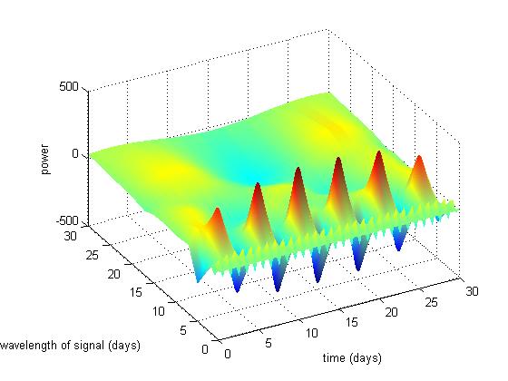
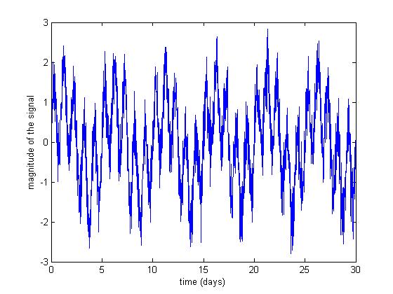
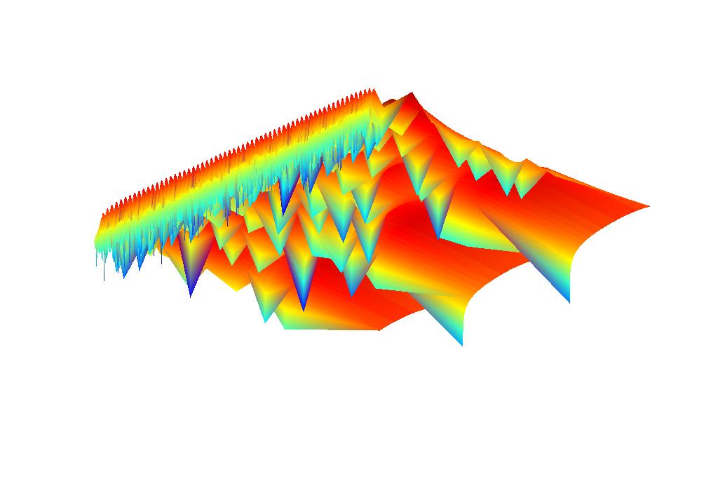
While trying to figure out how to do wavelet analysis I made this pretty plot. The data that forms the basis of the plot is here. Here's another pretty one, this time plotting the log of power, instead of plotting power directly.
While what I did isn't really like any of the wavelet analysis that is described in the books I got, it is what I want... the plot allows one to see how the frequency characteristics of the data change over time. For example, we expect to see a fairly strong daily cycle in temperature in Antarctica during summer when the sun is up. But during winter when there is no solar radiation, this cycle will be absent.
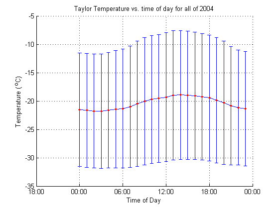
Daily cycle of temperature at the Taylor Glacier:
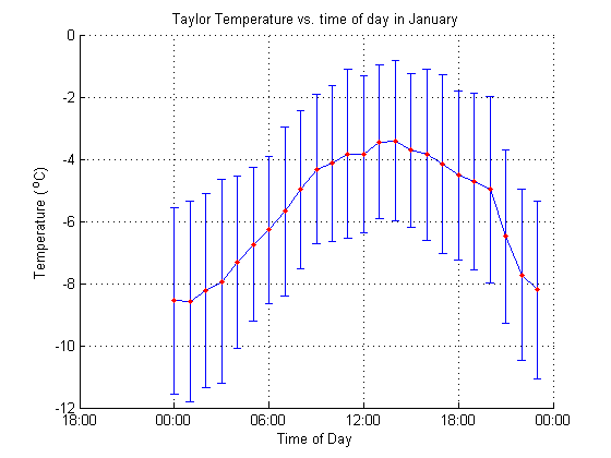
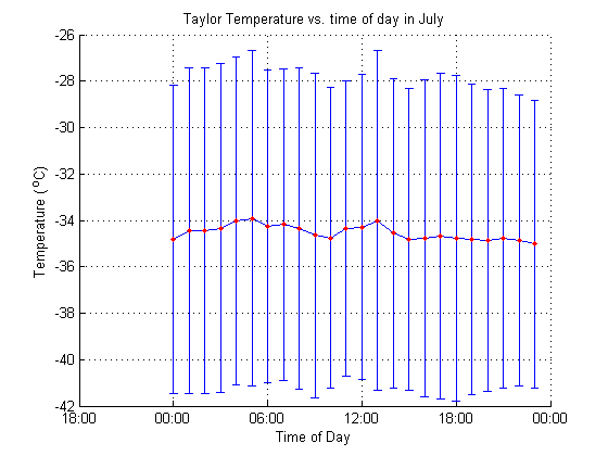
The red dots are the mean temperatures for each hour. The vertical blue error bars show the standard deviation about the mean for the points in each hour interval. Standard deviation is a measure of the variability of the data, so those times with long bars have more variable temperatures than those times with shorter bars.
January's daily cycle of temperature at the Taylor Glacier:
July's daily cycle of temperature at the Taylor Glacier:
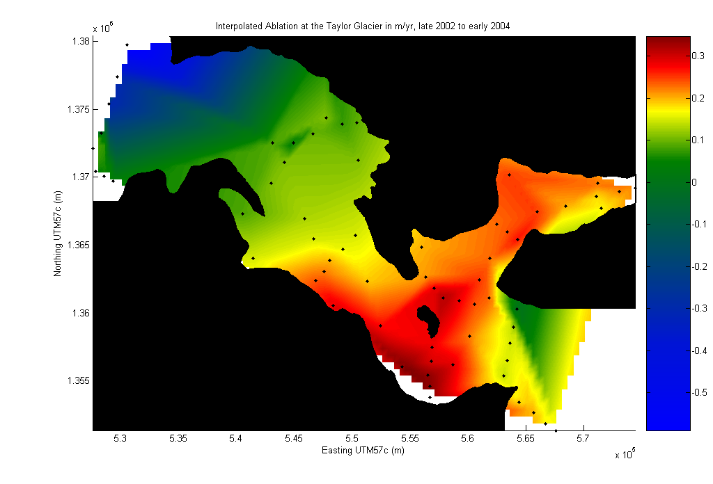
Ablation Map
The pattern of ablation on the Taylor Glacier is more complex than that of many glaciers. The black dots below show locations where we have ablation measurements on the glacier. The colored background is an interpolated representation of the data from the ablation poles. Ablation is plotted with units of meters per year. The black mask is the glacier outline. I'm using a UTM projection, zone 57c.
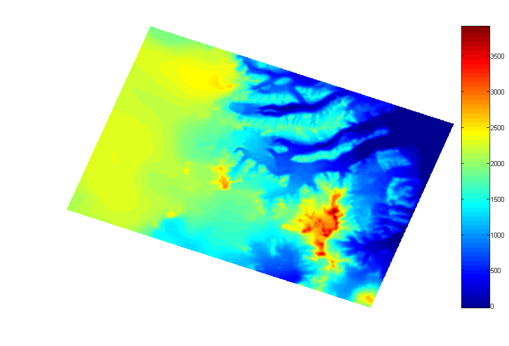
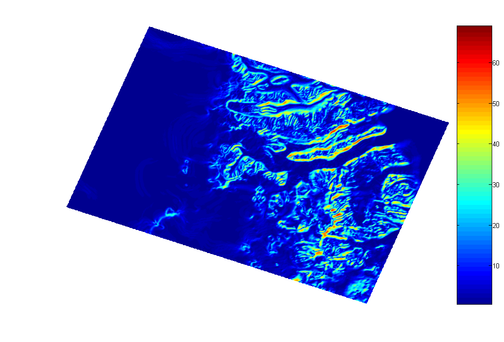
Digital Elevation Model
I finally got the RAMP DEM in a Matlab-readable form. The first plot shows the elevations in meters. The second shows the slope in degrees. North is up.